Just as a painter carefully selects colors to evoke specific emotions and moods, the choice of flooring color can greatly impact the overall feel and ambiance of a space.
This article explores the fascinating realm of color psychology and its relevance in flooring choices.
From the influence of warm and cool tones to the creation of visual illusions, we delve into the intricate interplay of color and flooring design, offering insights into how to create a harmonious and visually appealing environment.
Understanding Color Psychology
Understanding color psychology is essential for selecting flooring that aligns with the desired emotional and psychological impact of a space. Color associations play a significant role in how individuals perceive and respond to their environment. Different colors evoke varying emotional responses, influencing moods, behaviors, and overall well-being.
For instance, warm tones like red and orange are often associated with energy, passion, and warmth, while cooler tones like blue and green are linked to calmness, tranquility, and nature.
These color associations can guide the selection of flooring to create specific atmospheres within a space. For instance, in areas intended for relaxation and tranquility, such as bedrooms or meditation rooms, cool-toned flooring like soft blues or earthy greens can promote a serene ambiance. In contrast, vibrant and energizing spaces, such as fitness studios or social areas, may benefit from warm-toned flooring to stimulate enthusiasm and activity.
Impact of Warm Colors
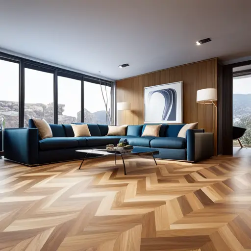
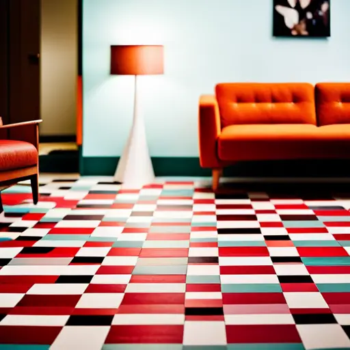
Warm colors have a significant impact on the emotional and psychological ambiance of a space, influencing the overall mood and energy levels within the environment. Warm tones such as red, orange, and yellow are known to evoke a range of emotions, from warmth and comfort to passion and excitement. When incorporated into interior design, these colors can create a welcoming and stimulating atmosphere.
Red, for example, is associated with energy and can increase heart rate and blood flow, while orange is often linked to feelings of enthusiasm and creativity. Yellow, on the other hand, is known for its uplifting and cheerful qualities.
In interior design, warm colors are often utilized in spaces where social interaction and energy are desired, such as living rooms, dining areas, and kitchens. These hues can add a sense of coziness and intimacy to a room, making it an inviting and vibrant space for occupants.
As we delve into the impact of warm colors, it’s important to also consider the influence of cool colors on the psychological and emotional aspects of interior design.
Influence of Cool Colors
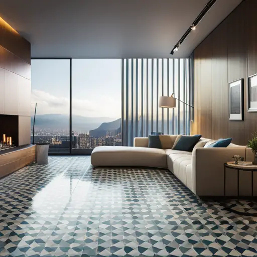
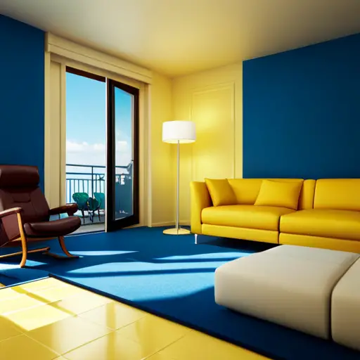
Cool colors, such as blue, green, and purple, have been found to have a calming and soothing influence on the psychological and emotional ambiance of interior spaces. When compared to warm colors, cool colors are known for their ability to create a sense of tranquility and relaxation.
The psychological effects of cool colors are well-documented, with research indicating that they can help lower blood pressure, reduce heart rate, and even decrease feelings of anxiety and stress.
In flooring choices, cool-colored materials can contribute to a sense of spaciousness and airiness, making them particularly suitable for smaller rooms or areas with limited natural light. Additionally, cool colors are often associated with nature, such as the calming blue of a clear sky or the refreshing green of a lush meadow, which can evoke feelings of serenity and rejuvenation.
Understanding the impact of cool colors on the human psyche is essential when considering flooring options, as they can significantly influence the overall mood and atmosphere of a space. By leveraging the psychological effects of cool colors, interior spaces can be transformed into tranquil retreats that promote relaxation and well-being.
Creating Visual Illusions
Utilizing color psychology in flooring choices involves harnessing the ability of visual illusions to manipulate the perception of space and enhance the overall ambiance of an interior environment. Visual impact plays a crucial role in creating illusions that can alter the perceived dimensions of a room. By strategically utilizing colors and patterns, flooring can visually expand a space, making it appear larger or cozier, depending on the desired effect.
Optical illusions can be achieved through various flooring design techniques. For instance, using light-colored flooring materials can create a sense of airiness and openness, giving the impression of a more expansive area. Conversely, employing darker hues can add warmth and intimacy to a room, making it feel more intimate and cozy. Additionally, the use of diagonal patterns can elongate the perceived length of a room, while horizontal patterns can make a space seem wider.
Embracing Neutral Tones
Neutral tones exude elegance and timelessness, making them a versatile choice for flooring that complements a wide range of interior design styles. Embracing neutral color palettes for flooring can bring a sense of timeless elegance to any space. When considering neutral tones, it’s important to remember that they can be more than just beige or cream.
Here are some examples of how neutral tones can be utilized to create stunning flooring options:
- Soft grey tones reminiscent of weathered wood planks
- Warm taupe hues offering a sense of earthy tranquility
- Subtle hints of ivory and off-white, evoking a feeling of pristine serenity
- Cool, muted shades of blue-grey, reminiscent of a peaceful coastal retreat
- Gentle, sandy tones that bring a touch of the beach indoors
Balancing Vibrant Hues
When it comes to balancing vibrant hues in flooring choices, it’s essential to consider the impact of color on the ambiance of a space. Vibrant colors can bring energy and vitality, but they must also harmonize with the overall decor to create a cohesive and inviting environment.
This balance is crucial for creating a flooring design that not only stands out but also complements the surrounding elements.
Color Impact on Ambiance
When selecting flooring colors, it is crucial to consider the impact of vibrant hues on the ambiance of the space. Color in design plays a significant role in eliciting emotional responses and setting the tone for a room. Balancing vibrant hues is essential to create a harmonious and inviting atmosphere.
Here are some key considerations:
-
Contrast: Using vibrant colors sparingly to create contrast and visual interest.
-
Complementary Tones: Pairing vibrant hues with neutral tones to balance the overall look.
-
Natural Light: Considering how natural light interacts with vibrant colors, affecting the perceived ambiance.
-
Spatial Perception: Understanding how vibrant hues can visually impact the perception of space.
-
Accents and Accessories: Incorporating vibrant colors through accents and accessories to add pops of energy without overwhelming the space.
Harmony With Decor
To achieve harmony with decor, it is imperative to carefully balance the use of vibrant hues within the flooring choices, ensuring they complement the overall aesthetic without overwhelming the space.
When it comes to decor coordination, vibrant flooring can be a bold statement or a complementary accent. It is essential to consider the existing color palette within the room and the overall design scheme.
Utilizing vibrant flooring in a space with neutral or muted decor can create a striking focal point, while in a room with already vibrant decor, it is crucial to ensure color harmony.
Selecting flooring colors that echo or complement existing decor hues can tie the room together, creating a cohesive and polished look.
Ultimately, balancing vibrant hues within flooring choices is about creating a visually appealing and harmonious space.
Significance of Light and Dark Shades
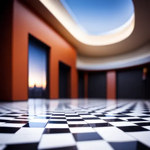
The significance of light and dark shades in flooring choices lies in their ability to influence the perceived size and atmosphere of a space. Light and dark contrast can create a color perception illusion, impacting the overall ambiance of the room. Here are some key points to consider when evaluating the significance of light and dark shades in flooring choices:
-
Light shades: Opting for light-colored flooring can make a room appear more spacious and airy. Light hues reflect more natural light, giving the illusion of a larger area.
-
Dark shades: Dark-colored flooring can add warmth and coziness to a space. It can create a sense of intimacy and can make a large room feel more intimate and inviting.
-
Visual impact: The contrast between light and dark shades can be used strategically to draw attention to specific areas of the room, such as a focal point or architectural details.
-
Maintenance considerations: Light-colored flooring may show dirt and stains more easily, while dark-colored flooring can conceal imperfections and require less frequent cleaning.
-
Style and design: Light and dark shades can be used to complement various interior design styles, from modern and minimalist to traditional and rustic.
Cultural Perspectives on Color
The cultural perspective on color plays a significant role in flooring choices, as different cultures attach specific meanings and symbolism to different colors. Understanding these cultural influences on color can help in making flooring choices that are not only aesthetically pleasing but also culturally appropriate.
This discussion will explore the diverse ways in which color is interpreted and utilized across various cultures, ultimately shedding light on the impact of cultural perspectives on flooring decisions.
Color Symbolism in Cultures
Color symbolism in various cultures plays a significant role in shaping perspectives and preferences for flooring choices. The cultural significance of color is deeply embedded in societal norms and traditions, influencing the way colors are perceived and utilized in interior design. Some examples of color symbolism in cultures include:
-
In Chinese culture, red symbolizes luck and happiness, making it a popular choice for flooring in homes and businesses.
-
In Indian culture, yellow represents spirituality and knowledge, often used in traditional homes and religious spaces.
-
In African cultures, the color green is associated with nature and fertility, often incorporated into flooring designs to symbolize growth and prosperity.
-
In Japanese culture, white signifies purity and simplicity, commonly used in minimalist flooring designs.
-
In Latin American cultures, vibrant colors like blue and orange are symbolic of energy and warmth, frequently used in lively and welcoming flooring choices.
Understanding the cultural symbolism of colors is crucial in making flooring choices that resonate with the values and beliefs of different communities. This awareness leads us to the subsequent section about ‘cultural influences on color’.
Cultural Influences on Color
Cultural perspectives on color play a significant role in shaping flooring choices, influencing the selection of hues and patterns that resonate with specific communities. Color symbolism and traditional beliefs deeply influence how different cultures perceive and use colors in their living spaces. Understanding the significance of specific colors to different cultures is crucial when designing or choosing flooring options. For example, in some cultures, red symbolizes luck and happiness, while in others, it represents passion or danger. Similarly, blue may be associated with tranquility and peace in one culture, while in another, it may symbolize sadness. This cultural variation in color symbolism impacts flooring choices, with certain communities preferring specific colors and patterns that align with their traditional beliefs.
| Cultural Perspective | Color Symbolism | Traditional Beliefs |
|---|---|---|
| Asian | Red – luck and happiness; Blue – prosperity | Colors used in traditional ceremonies and festivals |
| Middle Eastern | Green – fertility and wealth; White – purity | Reflects religious and cultural values |
| African | Yellow – prosperity and vitality; Black – power | Reflects cultural heritage and symbolism |
Frequently Asked Questions
Are There Any Studies or Research That Support the Impact of Color Psychology on Flooring Choices?
Research findings have shown that color psychology has a significant impact on design choices, including flooring. Color associations can influence mood and perception, affecting the overall ambiance of a space. This underscores the importance of considering color psychology in flooring selections.
How Do Different Flooring Materials Interact With Color Psychology, and How Does This Affect Flooring Choices?
When considering flooring materials, it’s crucial to understand how color psychology and trends in interior design interact. Different materials can evoke specific emotions and impact the overall aesthetic of a space, influencing flooring choices.
Are There Specific Colors That Are More Suitable for Certain Rooms or Spaces in a Home or Commercial Setting?
Color psychology in design plays a crucial role in creating the desired ambiance for different rooms or spaces in homes and commercial settings. Cultural influences also impact color choices, leading to specific color preferences for various environments.
How Can Flooring Color Choices Impact Mood and Productivity in a Work or Living Environment?
Flooring color choices can significantly impact mood and productivity in work or living environments. Certain colors evoke specific emotional responses, influencing individuals’ energy levels and focus. Moreover, color trends and design aesthetics play a crucial role in creating conducive spaces.
Are There Any Industry Trends or Emerging Theories in Color Psychology That May Influence Flooring Choices in the Future?
Emerging theories and industry trends in color psychology are shaping future flooring choices. These developments focus on the impact of colors on emotions, behavior, and well-being. Understanding these influences will likely drive innovative flooring designs and color palettes.
Conclusion
In conclusion, color psychology plays a significant role in flooring choices, impacting the overall atmosphere and perception of a space.
According to a study by the Journal of Environmental Psychology, warm colors like red and orange can increase arousal and stimulate activity, while cool colors like blue and green can promote relaxation and calmness.
Understanding the influence of different colors can help in making informed decisions when selecting flooring options for various environments.

Rubin Everest, a seasoned expert in the world of flooring, brings a wealth of knowledge and passion to the surface. As the mind behind ebbow.com, Rubin is dedicated to sharing insights on the latest trends, innovative solutions, and expert advice in the realm of flooring. Whether you’re seeking practical tips for installation or design inspiration, Rubin Everest is your go-to source for all things flooring-related, making your journey to the perfect floor an informed and enjoyable experience.